Central to understanding uncertainties is the gaussian distribution, or the normal distribution as it is often called. It is from the gaussian distribution that we justify adding in quadrature independent errors and, for instance, that the mean value of a distribution is actually the best estimate for the distribution. When we report uncertainties, you will usually find them written explicitly with their measurement, e.g., v = 45 +/- 10 km/s. This isn’t the whole story though. You can attach a probability to your measurement as well. If, in this example, 2 km/s is equal to the standard deviation, then you could say that your uncertainty is 1 sigma, and the probability associated with that is 68%, meaning that 68% of the time, your measurement falls within +/- 1 sigma.
There are tables in most statistics books (e.g., A Practical Guide to Data Analysis for Physical Science Students by Louis Lyons; An Introduction to Error Analysis: The study of uncertainties in physical measurements by John R. Taylor) that give the probabilities. If you’re talking about a normalized distribution, then
1 sigma = 68 %, 2 sigma = 95.4%, 3 sigma = 99.7 %, 4 sigma = 99.99 % and up.
Another way to think of this is by taking 1-Probability. So, 1 sigma means that 32% of the time, you don’t measure 45 +/- 10 km/s. At 3 sigma, you don’t measure 45 +/- 10 km/s only 0.3% of the time.
You may find this a confusing way to talk about uncertainties but let’s look at an example.
Example
You and another person takes measurements to determine the velocity of a boat. You find the v_boat = 45 +/- 10 km/s and report that this is a 1 sigma error bar, meaning if you were to do this exact measurement again, 68% of the time, your measurement would be 45 +/- 10 km/s.
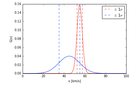
The other person finds v_boat = 46 +/- 10 km/s as well, but they report that this is a 4 sigma error. This means that if they were to repeat the experiment, they would find a velocity of 46 km/s 99.99% of the time. The figures below are plotting the probability distribution function (PDF) (think gaussian) as a function of velocity. The top plot (curve in blue) is the v_boat = 45 km/s. The bottom plot in red has the 55 km/s measurement. Various confidence levels are shown with the dashed lines. You should notice right away that the curves are much different.
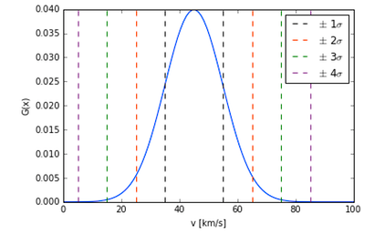
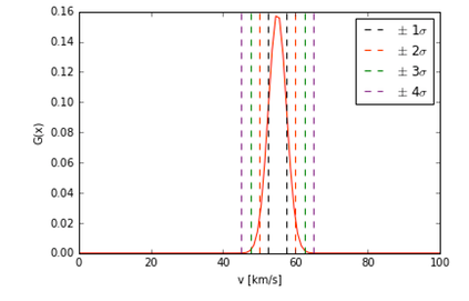
While it is true that your measurement and theirs are in agreement, meaning that the two measurements overlap when you account for the uncertainty, their measurement has the more precise measurement (note, I did not say the more accurate measurement, as there is a difference between the two statements.)
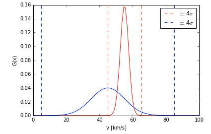
Let’s put your measurement into context. To say that you would measure 45 km/s 99.99% of the time, your 4 sigma error bar would be 4*10 km/s = 40 km/s. So your 4 sigma measurement is v_boat = 45 +/- 40 km/s. When you put it into this context, you can see why the other person has more precise, and perhaps more useful, measurement. The two figures below illustrate this. The top figure plots the PDF of both measurements. The dashed lines represent 4 sigma errors. Just from eyeballing the plot, you can see that the red curve is more precise because it is narrower than the blue curve. The bottom figure plots the same curves, but now the corresponding 1 sigma errors are given in the dashed lines.
Sometimes, it isn’t as easy to eyeball the results of a PDF. In which case, you would want to start thinking about calculating the area under the curves in order to compare the two, but this gets into a particular kind of statistical analysis called Bayesian Inference or Bayesian Analysis, which is outside the scope of this lab. However, it is a very useful (and popular) statistical method.
Chi Squared Test for a Distribution
On fits to data, like the least-squares fit, it is generally good to provide an estimate on how good a fit it is, which is different than just talking about the uncertainty of the slope or intercept. There are a variety of methods used to test distributions or fits. One that is easiest, it some ways, to understand and very common is the Chi Squared Test.
Note that many times, people talk about the reduced chi squared test, which is essentially a normalized value such that on average, the reduced Chi Squared should be 1. If it is much larger than one, the observed results do not fit the model. If it less than one, it is generally satisfactory. Though, it may also indicate that the errors are too large.
In terms of ease of understanding, the reduced chi squared test is more intuitive and usually all it requires is dividing the chi squared value by (number of data points - degrees of freedom), so it isn’t too much more work (once, of course you figure out how many degrees of freedom you have in your fit.)
